Multiple Meanings of MONoPOLE
MONoPOLE for design
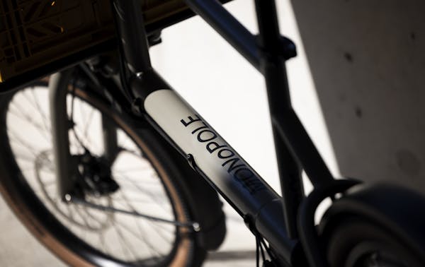
The etymology of the word monopole has an immediate connection to our frame design.
mono = single
pole = tubeThe long tube at the base of the frame is a strong and recognizable element of our toolbike. Our name refers to this particularity.
MONoPOLE for everyday bike
Developing the Toolbike typology, the sweet spot between a simple e-bike and a bulky cargobike, came from a desire to have one bicycle for all urban needs. As such, our Toolbike will be the only urban bike you ever need, or in other words: it will have the MONoPOLE as city bike.
As such, our Toolbike will be the only urban bike you will ever need: it will have the MONoPOLE.
MONoPOLE for steering
There is also a technical reason to explain our brand name. During the engineering process, special attention was given to the riding experience. We wanted our Toolbike to feel like riding a normal bike. For that reason, we innovated a proprietary steering mechanism with a toothed belt by Gates®. Until now, we believe we have a MONoPOLE on this system!
MONoPOLE for urban mobility
Finally, as our purpose states: «Improve your daily flow and inspire change.» One of the ways we want to inspire change is to encourage more people to switch to bicycles for their daily trips around the city. We aim to see cycling become a MONoPOLE for urban transportation, and we're proud to be part of that by offering a solution to make that happen.
Transposing the polysemy of our brand name into a logo didn't seem like an easy task. We have chosen to work with the agency WAAITT, from Copenhagen. The powerful simplicity of their work really attracted us. We sat down with them to understand how they took on this creative and defining endeavor.
How did the bike inspire you when creating the logo?
We understood the vision from the team to create a frame with a distinct shape and a unique geometry. We didn’t want to work this geometry into our designs because this could compromise the longevity of the visual identity. Furthermore, we realized that different wheel sizes is often a common denominator for cargobikes and that would probably remain. The name MONOPOLE has an inherent symmetry with the three Os, which could resemble bike wheels.
What was the thought and creative process for designing both logos?
When talking to the team, it became clear the design should reflect the aesthetic and conceptual approach to the bike. The aim was to create a sustainable product that is long-lasting and requires only a minimum of maintenance. It’s meant to make life in an urban environment more simple. Our approach to the logo was the same – to create something long-lasting by virtue of its simplicity.
We wanted to create something timeless, yet playful. Once we had identified the characteristic of the differently sized wheels, we experimented with implementing that observation in the word mark. The use of the lowercase O in the center of the uppercase word, makes for a simple, yet recognisable logo. Furthermore, the main characteristic of the word mark can be replicated with any typeface. So, the brand will still be identifiable if mentioned in an email or an article.
For the square logo, we wanted to avoid adding new elements or symbols, so we worked with the limitation of only using existing characters from the word mark. To keep the main characteristic, we quickly agreed that the square logo should at least contain an uppercase and a lowercase. As it is the first letter in the name, the tilted M is added on top as an abstract rider or cargo rack.
What message does the logo convey for you?
For us, the logo conveys the quality and timelessness of the product. The bold simplicity exudes a humble confidence and trustworthiness. The lowercase O is surrounded by uppercase letters adds an element of surprise and humor. The bike is a serious product and yet fun to ride!
Check out other great work by WAAITT here.